How to build a responsive website step by step

My messy adventure
Okay, so I want to be honest. When I first tried building a website, I thought it would be easy. Just throw in some text, maybe an image, done, right? Haha… nope. My first site looked fine on my laptop. Then I opened it on my phone. Disaster. The menu disappeared, images overlapped, text was tiny. Total chaos. That’s when I realized, okay, I really need to learn how to build a responsive website step by step.
I panicked a little, not gonna lie. But I also thought, well… this could be fun? I had no clue what I was doing, but I wanted my site to actually look decent on all devices. That’s what got me started.
Why I actually cared
At first, I didn’t care about mobile at all. My laptop looked fine, so why bother? Then one day, I tried showing my site to a friend on their phone. Embarrassing. The text was tiny, buttons were broken. Images were everywhere. I guess that was my wake-up call.
I finally decided to focus on how to build a responsive website step by step. I didn’t want to deal with fixing everything later. Plus, seeing a site actually work everywhere… there’s nothing like it.
My tiny toolkit
Here’s what I actually used:
● VS Code
● Google Chrome
● Basic HTML and CSS
That’s it. I didn’t need fancy software or frameworks. And honestly, just messing around for 20–30 minutes a day helped me more than long marathon sessions. Consistency wins.
Step 1: HTML chaos
The first lesson? HTML matters. I used to throw divs everywhere. Big mistake. Layouts were nightmares. Nothing aligned.
Once I cleaned it up and used proper semantic tags, learning how to build a responsive website step by step got easier. I could see where each section started and ended. It’s a small thing, but trust me, it makes everything else smoother.
Step 2: CSS panic
CSS scared me. I’d change a margin and the whole layout broke. At first, I wanted to give up. Then I started small: fonts, colors, spacing. Slowly, percentages and ems made sense.
When practicing how to build a responsive website step by step, I tried “mobile first” sometimes, “desktop first” other times. Either way, seeing columns stack properly on mobile? Feels like magic. Tiny victories, I swear.
Step 3: Media queries saved me
Before media queries, I had no idea how sites adjusted to phones or tablets. My first attempt? Total mess. Text overlapped, buttons disappeared, images freaked out.
After some trial and error, I got it. Media queries are like magic rules: “Hey screen smaller than 600px? Stack these columns.” Watching it work automatically made me feel like a wizard. Learning how to build a responsive website step by step suddenly became fun.
Step 4: Images… ugh
Images were the worst. Big ones would overflow, mess up my grids, push content around. I learned max-width: 100% and height: auto. Problem solved.
Now, whenever I work on how to build a responsive website step by step, I always make sure images scale. Little things like this separate “messy amateur site” from “okay, this actually works.”
Step 5: Menus that make sense
Menus were tricky. My first menu vanished on mobile. I wasted hours trying to fix it. Eventually, I learned about hamburger menus.
This is part of how to build a responsive website step by step: think about usability. Users need to find stuff, no matter the screen. Once I figured it out, my site finally felt… complete.
Step 6: Testing like a detective
After coding, I tested on everything: my phone, tablet, friend’s laptop… surprises everywhere. Buttons too small, text cut off, images overlapping.
Testing is actually the most important part of how to build a responsive website step by step. Every bug teaches you something. Every fix feels like progress. I still do this for every site, and I always find something tiny I missed.
Step 7: Flexbox, Grid, and random experiments
Once I had the basics, I tried Flexbox and CSS Grid. At first, I had no clue. Columns wouldn’t line up. Things overlapped. For some reason, margins hated me.
After a few hours, it clicked. I could finally make layouts behave without fighting the code. I also tried responsive fonts and made images load faster on phones. Some experiments totally failed. Others actually worked. Seeing my site finally act right on all screen sizes felt amazing. Honestly, this is my favorite part of learning how to build a responsive website step by step—the trial and error, the “aha” moments.
FAQ About How to Build a Responsive Website Step by Step
What does it mean to learn how to build a responsive website step by step?
It means slowly building a site that works everywhere. Structure, CSS, media queries, testing. One step at a time.
Can beginners actually do it?
Yes. Start small. Break things. Fix them. Repeat. That’s literally how I learned.
Do I need JavaScript?
Not at first. HTML and CSS are enough. JS is optional for interactivity.
How long to get good?
Everyone is different. For me, small consistent projects over weeks worked best.
What mistakes should I avoid?
Fixed widths, skipping media queries, ignoring testing. I hit all of these early on.
Final thoughts
Honestly? Web development isn’t about speed or talent. I learned way more from breaking things and fixing them than from tutorials.
Working on how to build a responsive website step by step taught me patience. Every tiny fix, every bug, every test… it added up. It’s messy, slow, sometimes frustrating. But that’s exactly how you get better.
If you’re starting, take small steps. Break stuff. Fix it. Laugh at your mistakes. That’s how real learning happens.
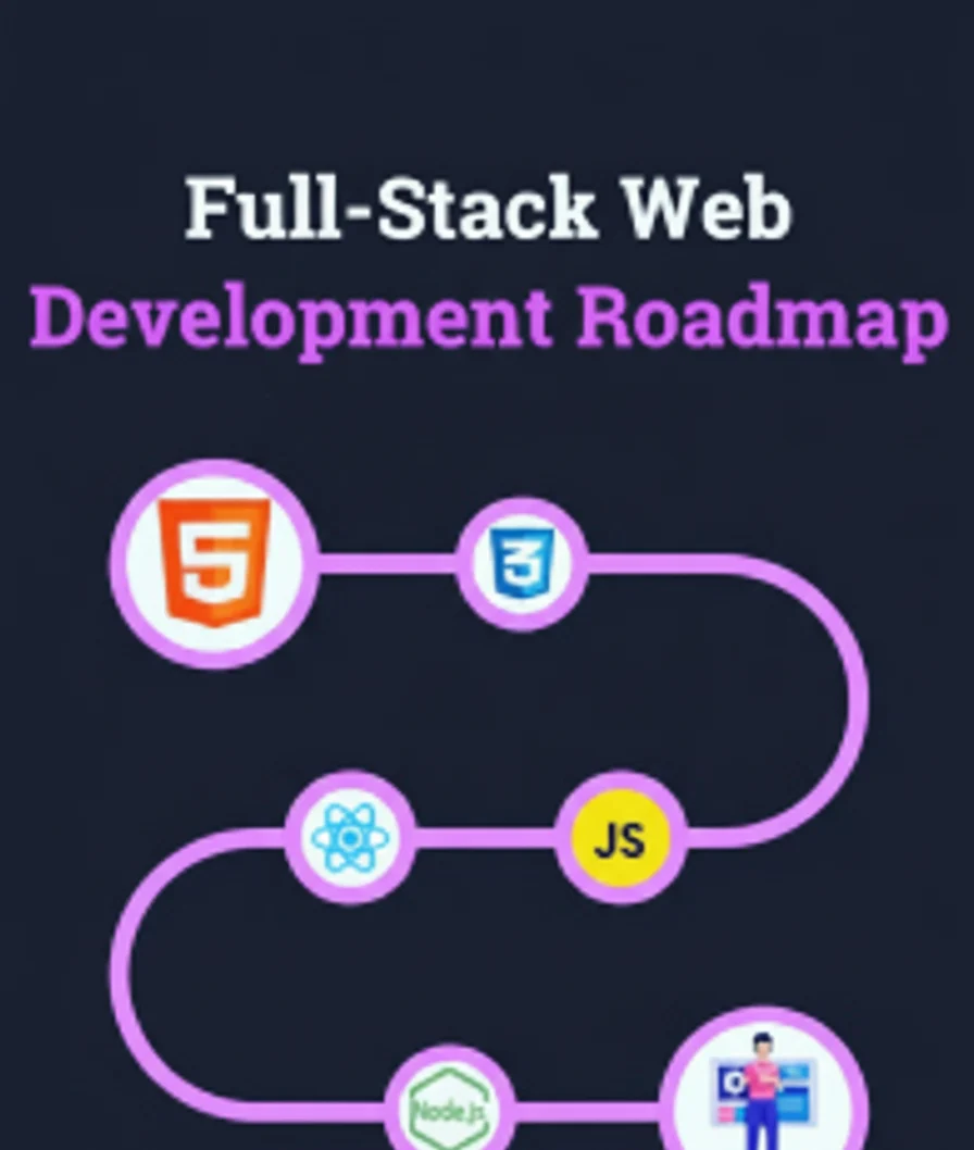
Full Stack Web Development Roadmap for 2026 – A complete step-by-step roadmap outlining technologies and learning paths to become a full-stack web developer in 2026. Full Stack Web Development Roadmap for 2026 – PickMyFuture


Hawai bet, feel like you are on vacation. Easy to navigate so I love hawai bet, what do you think, guys?
Bay888slot is my go-to when I’m feeling lucky. Those slots are on fire sometimes! Give bay888slot a spin!
Deskgamelogin is quick and painless. No hassle, just straight to the games. Nice one deskgamelogin!